logoDevHub
  • Categories
  • Submit Project
  • Collections
  • Pricing
  • Sponsors
Sign inSign up
Sign in

Categories

Browse Categories

AI34 projectsAPIs & Integrations7 projectsAR/VR0 projectsAuthentication4 projectsBlockchain & Crypto0 projectsBoilerplates18 projectsBusiness Analytics15 projectsCI1 projectsCMS7 projectsCharts1 projectsCloud4 projectsCode2 projectsData Science & Analytics0 projectsDatabases7 projectsDesign Tools12 projectsDevOps2 projectsDeveloper Tools63 projectsE-commerce5 projectsEducation Tech1 projectsEmails8 projectsFinance & FinTech2 projectsGaming Tech0 projectsGraphics & Illustration6 projectsGreen Tech0 projectsHardware0 projectsHealth Tech0 projectsHelpers6 projectsHosting & Infrastructure3 projectsIDE2 projectsInternet of Things (IoT)0 projectsMachine Learning0 projectsMarketing Tools29 projectsMobile Development1 projectsMonitoring5 projectsNatural Language Processing0 projectsNo-Code9 projectsOpen Source26 projectsPayment Gateways6 projectsPlatforms & Frameworks16 projectsProductivity18 projectsProject Management2 projectsPrototyping0 projectsRobotics0 projectsSaaS46 projectsSales Tools1 projectsSecurity3 projectsServerless4 projectsTesting & QA3 projectsUI & Libraries8 projectsWearables0 projectsWeb Development51 projectsWeb30 projectsWorkflow Automation7 projects

Quick Access

Trending NowBest of Month
Company LogoDevHub

Product Hunt alternative for startups

© 2025 DevHub. All rights reserved.

Build with ❤️ by SuperDir

Top 1 Product Badge (Light Theme)Top 1 Product Badge (Dark Theme)

Discover

  • Trending
  • Categories
  • Submit Project

Resources

  • Pricing
  • Sponsors
  • Blog
  • Help Center

Legal

  • Terms of Service
  • Privacy Policy
  • Attribution Badges

Connect

  • GitHub
  • Twitter / X

Products

  • SuperStarter
  • LicenseGen
  • AIChatOne
DevHub - AI-powered directory boilerplate | Product HuntExample ImageUneed POTD1 BadgeDevHub - AI-powered directory boilerplate | Startup FameBest SaaS Boilerplates Verified BadgePowered by Open-Launch

UI & Libraries

Lucide logo

Lucide

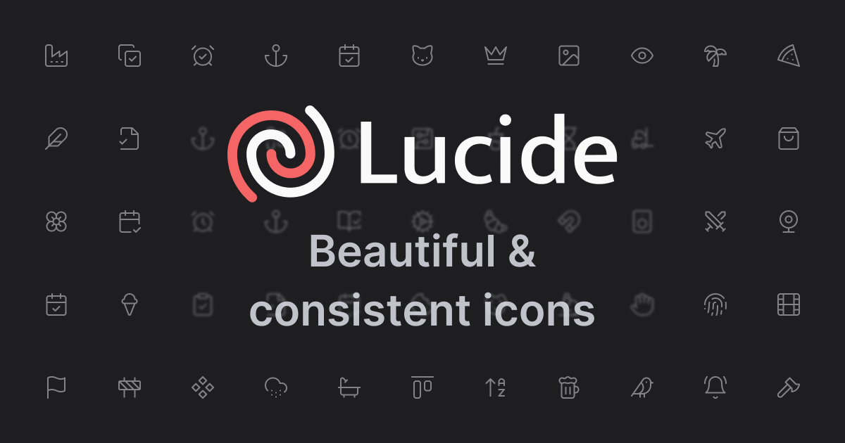
Lucide is a comprehensive and highly optimized open-source icon library designed to provide beautiful, consistent, and scalable vector graphics (SVG) for modern user interfaces. It serves as an essential toolkit for developers, designers, and product teams looking to enhance their applications with high-quality visual elements. Lucide's primary purpose is to offer a vast collection of icons that are easy to integrate and customize, ensuring a cohesive aesthetic across various platforms and applications.Key Features Lightweight & Scalable: Icons are delivered as highly optimized SVG, ensuring minimal file size and perfect rendering at any resolution. Clean & Consistent Design: Adheres to a strict set of design rules, guaranteeing uniformity in style and excellent readability across all icons. Customizable: Offers extensive customization options for color, size, stroke width, and more, allowing seamless integration with any UI theme. Packages Support: Available as a package for all major package managers, simplifying installation and management within development workflows. Tree Shakable: Designed for efficiency, allowing developers to import only the icons they use, significantly reducing bundle sizes. Active Community: Supported by a vibrant community on GitHub and Discord, providing ongoing development, support, and contributions.Use CasesLucide is an ideal solution for a wide range of development and design scenarios. For web developers, it simplifies the process of adding visually appealing and performant icons to websites, web applications, and single-page applications, ensuring a consistent look and feel across different components. Its tree-shakable nature makes it particularly beneficial for performance-critical applications, as it helps minimize the final build size.Designers can leverage Lucide to build robust design systems, ensuring that all visual elements adhere to a unified aesthetic. The customizable nature of the icons allows them to match specific brand guidelines effortlessly. Furthermore, Lucide can be integrated into various UI frameworks and libraries, making it a versatile choice for creating dashboards, mobile interfaces (via web views), and desktop applications built with web technologies.Pricing InformationLucide is released under the permissive ISC License, making it a free and open-source icon library for all users. While the core product is free to use, the project encourages and accepts sponsorships for its maintainers, allowing users and organizations to support its ongoing development and maintenance.User Experience and SupportLucide is designed for ease of use, offering a straightforward integration process through popular package managers. Its clean and consistent design philosophy extends to its usability, ensuring that developers and designers can quickly find and implement the icons they need. The project benefits from an active and supportive community on GitHub and Discord, providing channels for assistance, discussions, and contributions, which enhances the overall user experience and ensures ongoing support.Technical DetailsLucide icons are delivered as scalable vector graphics (SVG), a widely supported and highly flexible format for web and application development. The library is designed to be compatible with all major package managers, indicating its broad applicability across different JavaScript and front-end ecosystems. Its tree-shakable architecture is a key technical feature, optimizing performance by allowing selective imports of icons.Pros and Cons Pros: Highly optimized and lightweight SVG icons. Exceptional design consistency and readability. Extensive customization options for seamless branding. Easy integration via major package managers. Tree-shakable for optimized bundle sizes. Active community support and open-source license. Cons: Requires basic understanding of SVG and front-end integration. Customization, while powerful, may require initial setup. Reliance on community for specific icon requests. ConclusionLucide stands out as a robust, flexible, and community-driven icon library that provides developers and designers with a high-quality, customizable, and performant solution for their UI needs. Its commitment to consistency, scalability, and open-source principles makes it an excellent choice for any project. Explore Lucide today to elevate your application's visual appeal and user experience.

UI & LibrariesDesign ToolsDeveloper Tools
Iconify logo

Iconify

Iconify is a comprehensive platform that serves as the home for over 200,000 open-source vector icons, unified under a single, powerful framework. It simplifies the process of integrating and managing diverse icon sets, making it an indispensable tool for developers and designers seeking efficient visual asset management. Key Features Access to over 200,000 open-source vector icons from various popular sets. A unified framework for seamless integration and management of diverse icon libraries. Comprehensive Iconify API for dynamic icon retrieval and manipulation. Extensive documentation covering usage, icon browsing, libraries, and API details. Open-source licensing (MIT, Apache 2.0, GPL 2.0) for core components, ensuring flexibility and community contribution. Use Cases Iconify is highly beneficial for web developers and UI/UX designers who frequently work with visual assets. It streamlines the process of incorporating icons into websites, web applications, and other digital products, eliminating the hassle of managing disparate icon libraries. For instance, a front-end developer can quickly find and implement specific icons without worrying about format compatibility or licensing complexities, ensuring a consistent visual language across their projects. Similarly, design teams can leverage Iconify to maintain brand consistency and accelerate prototyping by having a vast, unified icon repository at their fingertips, significantly improving workflow efficiency. Pricing Information Iconify is an open-source project, primarily released under the MIT License, with some older packages using Apache 2.0 and/or GPL 2.0. This means the core framework is free to use, making it an accessible solution for individuals and organizations alike. There is no mention of paid tiers, subscriptions, or freemium models within the provided information. User Experience and Support The platform emphasizes ease of use, consolidating numerous icon sets into a single, manageable framework. Users can benefit from extensive documentation, including "Getting Started" guides, "How to Use Icons" tutorials, and detailed information on "Libraries for Developers" and the "Iconify API". Dedicated support options are also available, ensuring users can find assistance and resources for seamless integration and troubleshooting. Technical Details Iconify primarily deals with open-source vector icons, providing a robust API for programmatic access and integration. The project's core components are released under permissive open-source licenses, predominantly MIT, with some older parts under Apache 2.0 and GPL 2.0. This open-source nature allows for community contributions and ensures transparency in its development. Pros and Cons Pros: Extensive library of over 200,000 open-source vector icons. Streamlined management through a single, unified framework. Completely open-source and free to use for core functionalities. Robust API for dynamic icon handling and integration. Comprehensive documentation and support resources. Cons: Users must verify individual icon set licenses, as they vary. Primarily code-driven, potentially requiring a learning curve for non-developers. Conclusion Iconify stands out as an invaluable resource for anyone working with digital icons, offering unparalleled access to a vast, organized, and easily integratable collection. Its open-source nature and unified framework make it a highly efficient and cost-effective solution for enhancing visual design. Explore Iconify today to simplify your icon management and elevate your projects.

Design ToolsDeveloper ToolsUI & Libraries
Chakra UI logo

Chakra UI

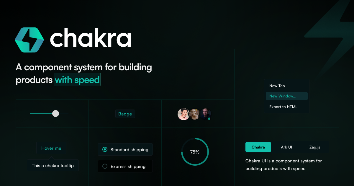
Introduction Chakra UI is a simple, modular, and accessible component library designed for React applications. It provides developers with essential building blocks to create user interfaces quickly and efficiently, targeting anyone building modern web applications with React. Key Features Accessibility: Strictly follows WAI-ARIA standards for all components, ensuring inclusive design. Themeable: Highly customizable, allowing developers to match components to their specific design needs. Composable: Designed with composition in mind, enabling easy creation of new components. Light and Dark UI: Optimized for multiple color modes, offering flexibility for user preferences. Developer Experience: Guaranteed to boost productivity with intuitive APIs and sensible defaults. Active Community: Supported by a team of active maintainers and a large Discord community for support. Use Cases Chakra UI is ideal for developers looking to accelerate the development of their React applications. It streamlines the process of building user interfaces by providing pre-built, accessible components, reducing the need to write UI code from scratch. This allows teams to focus more on core business logic and less on UI implementation details. Specific scenarios include building dashboards, marketing websites, e-commerce platforms, or any web application where speed, accessibility, and customizability are paramount. Its opinionated yet flexible nature makes it suitable for both rapid prototyping and large-scale production applications, ensuring a consistent and high-quality user experience across different projects. Pricing Information Chakra UI is primarily an open-source library (MIT licensed), making its core functionalities freely available. Additionally, it offers "Chakra UI Pro," which includes premium components for those looking to build even faster, indicating a freemium model where advanced features or components are available for purchase. User Experience and Support The library is praised for its ease of use, amazing documentation, and high customizability. Developers benefit from a well-designed system with solid accessibility defaults and a great out-of-the-box look. Support is readily available through an active community on Discord and dedicated maintainers who ensure continuous improvement and assistance. Technical Details Chakra UI is built for React applications and leverages technologies like Styled System and Emotion CSS for its styling capabilities. This foundation provides a powerful and flexible way to manage component styles and themes. Pros and Cons Pros: Easy to use with intuitive APIs. Comprehensive and well-structured documentation. Highly customizable to fit any design. Strong focus on WAI-ARIA accessibility standards. Supports both light and dark UI modes. Boosts developer productivity significantly. Backed by a vibrant and supportive community. Cons: As an opinionated design system, it might require some adaptation for teams with very specific, pre-existing design systems. While highly customizable, deep overrides might have a learning curve for new users. Reliance on React means it's not suitable for projects outside the React ecosystem. Conclusion Chakra UI stands out as a robust, accessible, and developer-friendly component library that empowers teams to build beautiful React applications with speed and confidence. Its commitment to accessibility, flexibility, and an excellent developer experience makes it a top choice for modern web development. Explore Chakra UI today to accelerate your next project and deliver exceptional user interfaces.

UI & LibrariesDeveloper ToolsWeb Development
Radix Themes logo

Radix Themes

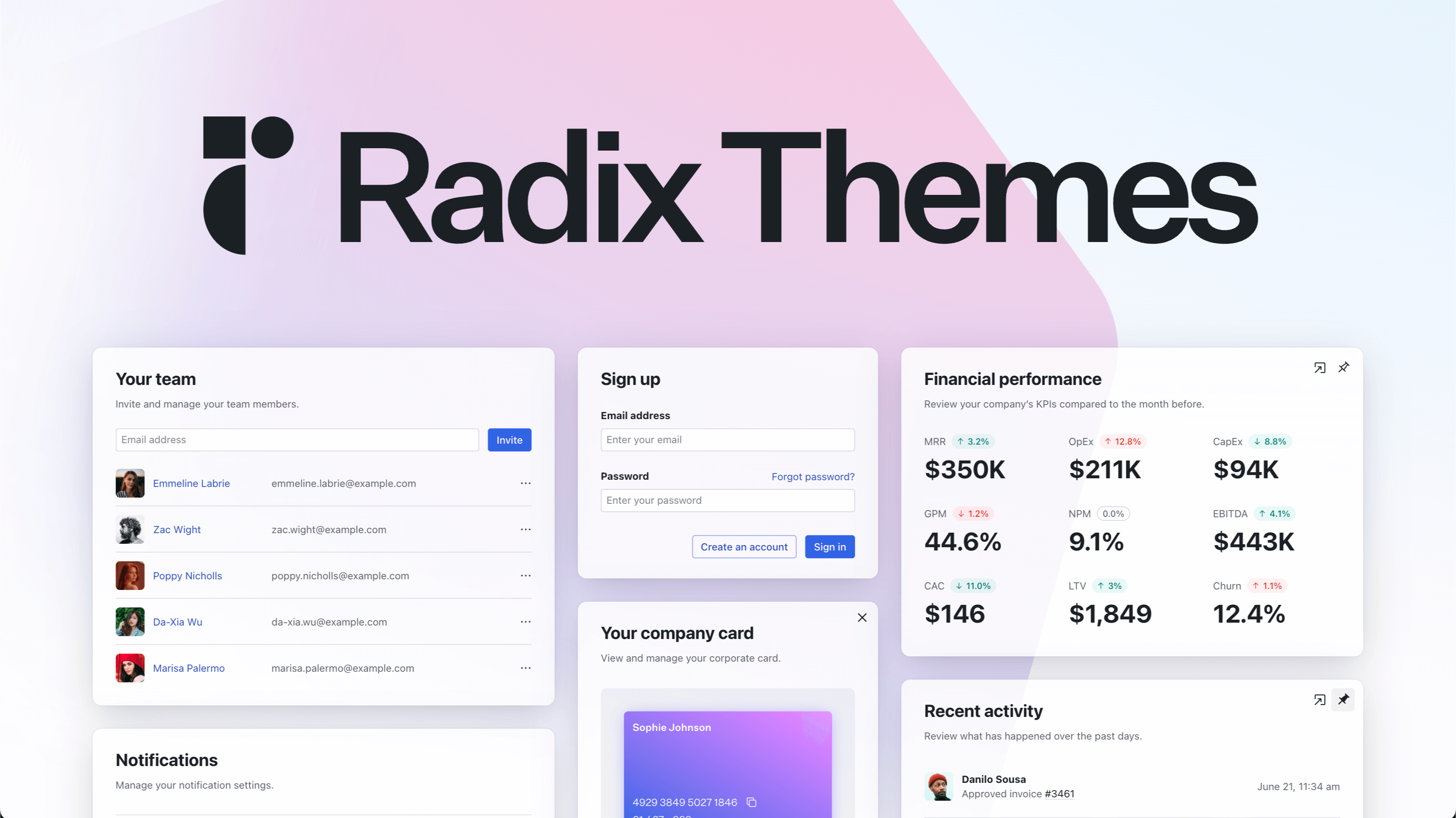
Introduction: Radix Themes is an open-source component library designed to accelerate the development of high-quality, accessible user interfaces. It targets developers and teams looking for a robust, pre-configured solution to build modern web applications with ease and efficiency. Key Features: Open-source and free to use with a freemium model. Optimized for fast development and easy maintenance. Built with accessibility as a core principle. Requires no configuration – simply import and start building. Includes a comprehensive set of UI primitives, icons, and color palettes. Provides pre-built themes for consistent design. Use Cases: Radix Themes is ideal for a wide range of web application development scenarios. For instance, it can be used to rapidly prototype and build new applications, significantly reducing development time thanks to its "import and go" nature. Teams can leverage its components to create sophisticated dashboards for financial management, including expense tracking, invoicing, payment processing, and detailed financial reporting (MRR, OpEx, CapEx, GPM, NPM, EBITDA, CAC, LTV, Churn). Beyond financial tools, Radix Themes facilitates the creation of robust user and team management interfaces, allowing for easy invitation and administration of team members. It also supports the development of comprehensive notification systems, enabling users to manage alerts for comments, favorited items, and new document creation via push, email, or Slack. Furthermore, it's well-suited for building productivity tools, such as task management systems with to-do lists, and activity logs to review recent actions within an application. Pricing Information: Radix Themes operates on a freemium model, offering a "Basic" plan at $0/month for up to 3 team members, which includes essential features like expense tracking, invoicing, and email support. All plans come with a 30-day trial of Pro features. Paid tiers include "Growth" at $49/month for up to 10 team members, adding online payments, recurring invoices, and phone support, and "Pro" at $99/month for unlimited team members, offering advanced features like custom invoices, multi-business support, app integrations, and priority support. User Experience and Support: The library emphasizes ease of use with its "no configuration required" approach, allowing developers to quickly integrate components. The provided examples showcase a clean, intuitive user interface design across various application types, from team settings to financial dashboards. Support options scale with pricing tiers, ranging from email support on the Basic plan to priority support on the Pro plan. Documentation, a playground, and a blog are available to assist users in learning and implementing the library effectively. Technical Details: Radix Themes is an open-source component library primarily built for web development. While specific frameworks aren't explicitly stated beyond the import syntax suggesting a JavaScript/TypeScript environment, the component-based structure is highly compatible with modern front-end frameworks like React, Vue, or Angular, with React being strongly implied by the example code snippet. It leverages standard web technologies like CSS for styling. Pros and Cons: Pros: Free and open-source with a generous freemium tier. Significantly speeds up UI development. Ensures high accessibility standards out-of-the-box. Minimal setup and configuration required. Provides a wide array of pre-designed, customizable components. Cons: Specific framework compatibility (e.g., React only) is not explicitly stated, though implied. Extensive customization might require deeper understanding of the library's internals. Reliance on the library for design system might limit unique branding without custom theming. Conclusion: Radix Themes offers a powerful and efficient solution for developers aiming to build accessible, high-quality web applications rapidly. Its open-source nature, ease of use, and comprehensive component set make it an invaluable tool for any modern development workflow. Explore Radix Themes today to streamline your UI development process and create stunning, accessible user experiences.

UI & LibrariesOpen SourceDeveloper Tools
Vue.js logo

Vue.js

IntroductionVue.js is a progressive JavaScript framework designed for building robust and performant web user interfaces. It's an approachable and versatile solution primarily aimed at developers looking to create single-page applications, complex UIs, or even full-featured web applications.Key Features Approachable: Builds on standard HTML, CSS, and JavaScript with an intuitive API and world-class documentation, making it easy to learn and adopt. Performant: Features a truly reactive, compiler-optimized rendering system that minimizes the need for manual optimization, ensuring fast and efficient applications. Versatile: Offers a rich, incrementally adoptable ecosystem that scales seamlessly from a small library for specific UI components to a comprehensive framework for large-scale applications. Open-Source: Released under the MIT License, providing a flexible and community-driven development environment.Use CasesVue.js is exceptionally well-suited for a wide range of web development projects. Developers can leverage it to build dynamic and interactive user interfaces for SaaS platforms, e-commerce sites, dashboards, and content management systems. Its incremental adoptability means it can be integrated into existing projects to enhance specific parts of a UI, or used to build entirely new, complex single-page applications from the ground up.It addresses common development challenges by providing a structured yet flexible way to manage application state, render components efficiently, and interact with APIs. Whether you're a beginner or an experienced developer, Vue.js offers the tools to streamline your workflow and deliver high-quality web experiences.Pricing InformationVue.js is an open-source project released under the MIT License, making it completely free to use for personal and commercial projects. While the framework itself is free, the project is supported by sponsorships, with opportunities for Platinum and Gold Sponsors to contribute to its ongoing development.User Experience and SupportThe framework boasts an intuitive API and world-class documentation, which significantly contributes to a smooth developer experience. Comprehensive guides, tutorials, and examples are readily available to help users get started and master the framework. For support and community engagement, developers can connect via Discord Chat, GitHub Discussions, and the DEV Community, fostering a collaborative environment.Technical DetailsVue.js is a JavaScript framework that builds upon standard web technologies: HTML, CSS, and JavaScript. It utilizes a compiler-optimized rendering system to ensure high performance and reactivity. Its core principles revolve around component-based architecture, allowing for modular and reusable code.Pros and Cons Pros: Highly approachable with excellent documentation. Exceptional performance due to reactive and optimized rendering. Flexible and incrementally adoptable for various project sizes. Strong, active community and extensive ecosystem. Open-source and free to use. Cons: Requires foundational knowledge of JavaScript, HTML, and CSS. While versatile, very large enterprise applications might require more opinionated frameworks or additional architectural patterns. The ecosystem, while rich, can sometimes lead to choice paralysis for new users. ConclusionVue.js stands out as a progressive and highly effective JavaScript framework for building modern web user interfaces. Its blend of approachability, performance, and versatility makes it an excellent choice for developers aiming to create dynamic and efficient web applications. Explore the official documentation and community resources to unlock the full potential of Vue.js for your next project.

Web DevelopmentDeveloper ToolsUI & Libraries
Prism UI logo

Prism UI

PrismUI Components is a cutting-edge, fully customizable component library built on top of shadcn/ui, designed to accelerate the development of beautiful, accessible, and production-ready applications. It targets developers and teams looking to ship high-quality products in half the time by providing a robust foundation of UI elements and templates. Key Features Fully customizable component library built on shadcn/ui. Over 50 beautiful sections and templates crafted with React, TypeScript, Tailwind CSS, and Framer Motion. Comprehensive set of UI components including Display Cards, Expandable Cards, Floating Action Panels, Logo Carousels, and Form Components. Battle-tested designs ensuring high quality and conversion rates. Actively maintained with regular updates, fixes, and new features. Use Cases PrismUI is ideal for a wide range of development scenarios. For instance, it can be used to rapidly construct marketing websites with engaging display cards and logo carousels, helping businesses showcase their content and partners effectively. Its ready-to-use templates are perfect for quickly launching admin panels and dashboards, streamlining internal operations and data visualization. Furthermore, developers can leverage PrismUI to build interactive user interfaces such as project status trackers with expandable cards, or implement quick forms and contextual actions using the floating action panel. By providing a solid UI foundation, PrismUI allows teams to focus on core product logic rather than spending valuable time on UI development, making it suitable for startups and enterprises alike. Pricing Information PrismUI is proudly open-source, with its source code freely available on GitHub. This means users can access, read, review, and contribute to the library without any direct cost, fostering a collaborative development environment. User Experience and Support The library emphasizes a seamless user experience, offering beautiful and accessible designs that are production-ready. It aims to simplify UI development, allowing users to focus on their product's unique value proposition. While specific support channels aren't detailed, the platform encourages users to "Join our growing community" and provides "Documentation" and "Components" sections, suggesting resources for learning and assistance. Technical Details PrismUI is built using modern web technologies, including React for declarative UI, TypeScript for type safety, Tailwind CSS for utility-first styling, and Framer Motion for elegant animations. It leverages shadcn/ui as its underlying framework, ensuring a robust and flexible architecture. Pros and Cons Pros: Accelerates development time significantly. Offers a wide array of beautiful and accessible components and templates. Built with modern, popular technologies (React, TypeScript, Tailwind CSS). Open-source and actively maintained with community contributions. Reduces the need for custom UI development, saving resources. Cons: Reliance on specific frameworks (React, Tailwind CSS) might require familiarity. Customization beyond provided options might require deeper understanding of the underlying technologies. Conclusion PrismUI Components stands out as a powerful and efficient solution for building modern web applications. Its comprehensive, open-source nature, combined with its focus on speed and design quality, makes it an invaluable asset for any development team. We encourage you to explore PrismUI further and contribute to its growing community on GitHub to experience faster, more beautiful product development.

UI & LibrariesDeveloper ToolsOpen Source
Tremor logo

Tremor

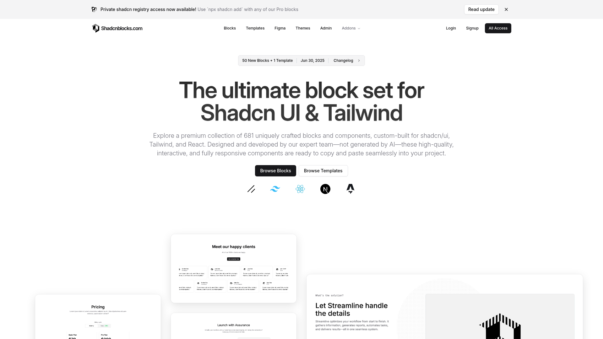
Introduction Tremor is a comprehensive collection of open-source React components designed to accelerate the development of beautiful and functional dashboards and analytical interfaces. It empowers developers to build data-rich applications with ease, focusing on data presentation rather than intricate UI design. Key Features 35+ fully open-source and accessible components for dashboards and charts. Built with beautiful defaults and simple props for quick customization. Modular input components for complex data filtering and interaction. Advanced visualizations like Tracker and Bar Lists for complex use cases. Micro visualizations such as Data Bars, Spark Charts, and Progress Circles to highlight small details. Access to over 250 pre-built blocks and templates for a head start on projects. Use Cases Tremor is ideal for creating sophisticated analytical dashboards, internal tools, and data-driven applications. Developers can leverage its extensive component library to build interfaces that allow users to interact with and understand their data more effectively. For instance, it simplifies the creation of complex data filters, enabling users to refine data views with multi-logic and multi-checkbox options. Furthermore, its advanced and micro visualizations are perfect for presenting intricate data patterns and key performance indicators gracefully, making it suitable for financial dashboards, marketing analytics platforms, or operational monitoring systems. Pricing Information Tremor offers a tiered pricing model, including Starter, Premium, and Enterprise plans, which appear to be based on usage (e.g., "10k requests," "50k requests"). While specific pricing details are not provided, the availability of an NPM package suggests a straightforward integration process, and the "Get started in seconds" implies accessibility for initial exploration. User Experience and Support Tremor prioritizes a smooth user experience for both developers and end-users. Its components come with "beautiful defaults" and "simple props," allowing developers to focus on data rather than design. The library is "accessible by design," built on Recharts and Radix UI, and offers full support for keyboard navigation, ensuring inclusivity. Comprehensive documentation, changelogs, and community support (via GitHub and X) are available to assist developers. Technical Details Tremor is built on modern web technologies, primarily React, Tailwind CSS, and Radix UI, ensuring a robust and scalable foundation. Its charting capabilities are powered by Recharts. The availability of templates built with React and Next.js further highlights its compatibility with contemporary web development stacks. Pros and Cons Pros: Open-source and accessible components. Rapid development with pre-built blocks and templates. Highly customizable with simple props. Strong focus on data visualization and analytical interfaces. Built with modern, popular frameworks (React, Tailwind CSS, Next.js). Excellent user experience with keyboard navigation and beautiful defaults. Cons: Requires familiarity with React and Tailwind CSS. Specific pricing details are not explicitly provided in the text. May have a learning curve for advanced customization beyond simple props. Conclusion Tremor offers an invaluable toolkit for developers aiming to build high-quality, data-centric web applications efficiently. Its rich set of components, coupled with a strong emphasis on accessibility and design, makes it a compelling choice for anyone looking to create production-ready dashboards. Explore Tremor today to transform your data into insightful and engaging user experiences.
ChartsUI & LibrariesDeveloper Tools
Shadcnblocks logo

Shadcnblocks

Introduction: Shadcnblocks.com is a premium component library offering an extensive collection of uniquely crafted UI blocks and components, specifically designed for developers and designers leveraging shadcn/ui, Tailwind CSS, and React. It serves as an invaluable resource for rapidly building high-quality, interactive, and fully responsive web applications and marketing pages. Key Features: Over 681 high-quality, expert-designed blocks and components. Custom-built for seamless integration with shadcn/ui, Tailwind CSS, and React. Interactive and fully responsive components, ready for copy-and-paste. Continuous updates with 50+ new blocks and 1+ new template added monthly. Includes a Figma Kit and Admin Kit for comprehensive design and development. Offers a variety of block categories including Hero, Feature, Pricing, Login, and more. Use Cases: Shadcnblocks.com is ideal for accelerating the development of various web projects, from stunning landing and marketing pages to complex admin dashboards and internal tools. Developers can quickly assemble full-width sections and components, significantly reducing design and development time. It addresses the common challenge of creating consistent, aesthetically pleasing, and functional UI elements from scratch, allowing teams to focus on core application logic rather than repetitive front-end work. This library is particularly beneficial for startups, agencies, and individual developers aiming to launch products faster with a professional and polished user interface. Pricing Information: Shadcnblocks.com operates on a paid, one-time payment model for lifetime access. The "Individual" plan is priced at $149 USD, offering lifetime access, updates, and all 681+ Pro Blocks. The "Team pro" plan is available for $299 USD, including all "Individual" features plus 4+ Premium Templates, 1+ new template each month, a Figma Kit, and an Admin Kit. Free and basic blocks are also available for users to try before committing to a purchase. User Experience and Support: The platform emphasizes ease of use with its copy-and-paste functionality, allowing developers to quickly integrate components into their projects. The components are designed to be high-quality and interactive, ensuring a smooth user experience for the end-users of applications built with Shadcnblocks.com. Support resources include an FAQ section, a Changelog, and documentation, providing guidance for users. Technical Details: Shadcnblocks.com components are built upon robust and widely adopted web technologies, including shadcn/ui, Tailwind CSS, and React. The library also supports integration with modern frameworks like Astro and Next.js, making it versatile for various project setups. The availability of a Figma Kit further enhances the design workflow, ensuring consistency between design and development. Pros: Extensive and growing library of 681+ high-quality components. Expert-designed, ensuring professional and non-AI generated quality. Significant time-saving due to copy-and-paste integration. Lifetime access with continuous updates and new content. Fully responsive and interactive components. Strong compatibility with popular modern web frameworks (React, Astro, Next.js). Option to try free blocks before purchase. Cons: Requires a one-time payment for full access. Relies on specific tech stack (Shadcn UI, Tailwind, React), which might be a learning curve for new users. Customization beyond provided options might require deeper knowledge of Tailwind CSS. Conclusion: Shadcnblocks.com stands out as a comprehensive and high-value resource for developers and designers seeking to streamline their web development workflow. By providing a vast collection of expertly crafted, ready-to-use UI components, it empowers users to build stunning and functional web applications with unprecedented speed and efficiency. Explore Shadcnblocks.com today to elevate your project's design and accelerate your development process.

UI & LibrariesWeb DevelopmentDesign Tools